


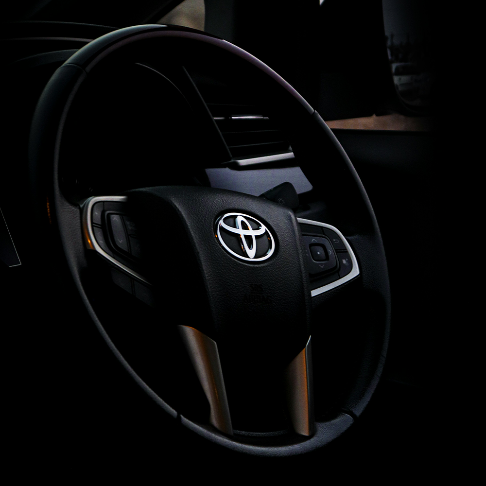
 The Toyota logo is easily one of the most well-known symbols in the car industry. It goes beyond being just a brand; it truly captures Toyota’s principles, aspirations, and dedication to being the best. In this piece, we’ll explore the thought process and marketing tactics that went into creating the legendary Toyota trademark.
The Artistry Behind the ‘T’
Think about this: the Toyota symbol is more than just meets the eye; it’s a love story in the form of an emblem.
The three ellipses in the logo design aren’t just simple circles; they symbolize a beautifully choreographed dance.
Imagine this: the ellipses represent you (yes, you, the valued customer), the amazing Toyota products, and, naturally, the very essence of the brand–its heartbeat.
 Each ellipse represents different elements: the red ellipse symbolizes customers’ trust and confidence in Toyota, the outer oval signifies global expansion, and the inner oval represents technological advancement.
Take a closer look and check it out–right there in the middle, the letter ‘T’ appears as if by magic, like the special ingredient in a classic recipe. It may be simple, but it holds immense power. This sleek masterpiece isn’t just about looks; it tells a story of how customer happiness, innovative products, and the ever-pulsating heart of the brand are all connected.
Strategy Overdrive
 But wait a minute, we’re only just beginning! Toyota’s marketing plan isn’t just about making a big splash. The trademark’s simplicity isn’t by chance; it reflects Toyota’s commitment to being efficient, dependable, and practical. It’s like the superhero cape for cars – straightforward, iconic, and recognized everywhere.
The logo’s color selection holds great importance. Red signifies passion, energy, and determination, which are qualities Toyota aims to infuse into its products. Conversely, white embodies purity, integrity, and innovation, which are fundamental values deeply rooted in Toyota’s DNA.
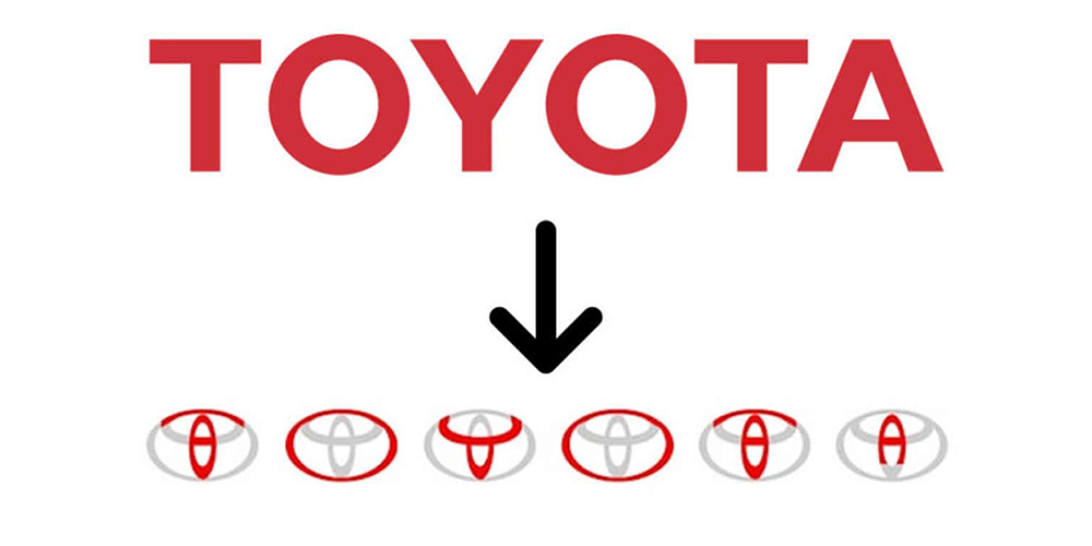
Now, about consistency–-it’s the secret sauce in Toyota’s brand recipe. The brand’s symbol has been polished over the years, like a classic car in a collector’s garage. The tweaks aren’t drastic; they’re like a well-fitted suit-–timeless, modern, and always in vogue.
Toyota Logo: Global Appeal
Oh, did we mention its global appeal? The brand’s trademark isn’t just a local rockstar; it’s a world–renowned sensation. The design transcends language barriers and cultural quirks. It’s like the James Bond of logos–-suave, adaptable, and effortlessly cool, no matter where it goes.
So, here’s the deal: imagine if your brand had a logo that speaks a universal language. A logo that’s not just seen but remembered. Imagine the impact! And guess what? It’s not rocket science; it’s the Toyota way-–simple, consistent, and globally magnetic.
But what makes this logo so effective from a marketing perspective?
One word: simplicity.
The clean lines and minimalistic design make it easily recognizable, even from a distance. This simplicity allows for easy reproduction across various mediums, such as print ads, billboards, websites, and social media platforms.
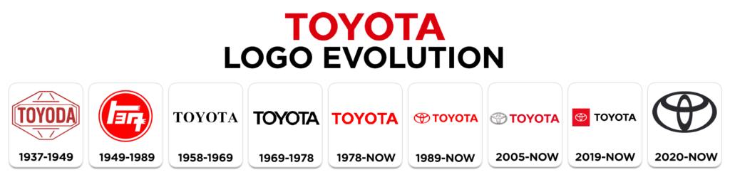
Moreover, the company logo has stood the test of time. Since its inception in 1989, it has remained largely unchanged. This consistency has created a sense of familiarity among consumers worldwide. When they see the logo on a vehicle or an advertisement, they immediately associate it with quality craftsmanship and reliability.
 Furthermore, Toyota understands the power of storytelling in connecting with consumers emotionally. They have used their logo as a visual cue to communicate their brand story –one of continuous improvement and customer satisfaction. Through cleverly crafted advertisements that highlight their technological advancements or commitment to environmental sustainability, Toyota has successfully built a positive brand image.
In conclusion, the Toyota logo is not just a symbol; it represents the essence of Toyota as a company. Its design elements and color choices reflect the brand’s values and aspirations. With its simplicity and timeless appeal, the logo serves as a powerful marketing tool that helps Toyota connect with consumers on a deeper level. It is no wonder that the his iconic logo has become synonymous with quality, reliability, and innovation in the automotive industry.
Related Posts
The Apple Logo: The Bite That Changed Everything
Take a look at the history and the role of branding media in shaping the Apple symbol. Apple Inc., a...
The Fascinating Story behind Audi’s Logo Evolution
Join us on an intriguing exploration into the depths of Audi's brand and logo evolution. Let’s uncover...
Nestle’s Logo Design Evolution: Impact on Brand Identity
Nestle's logo design evolution has played a crucial role in shaping consumer perception and its brand...